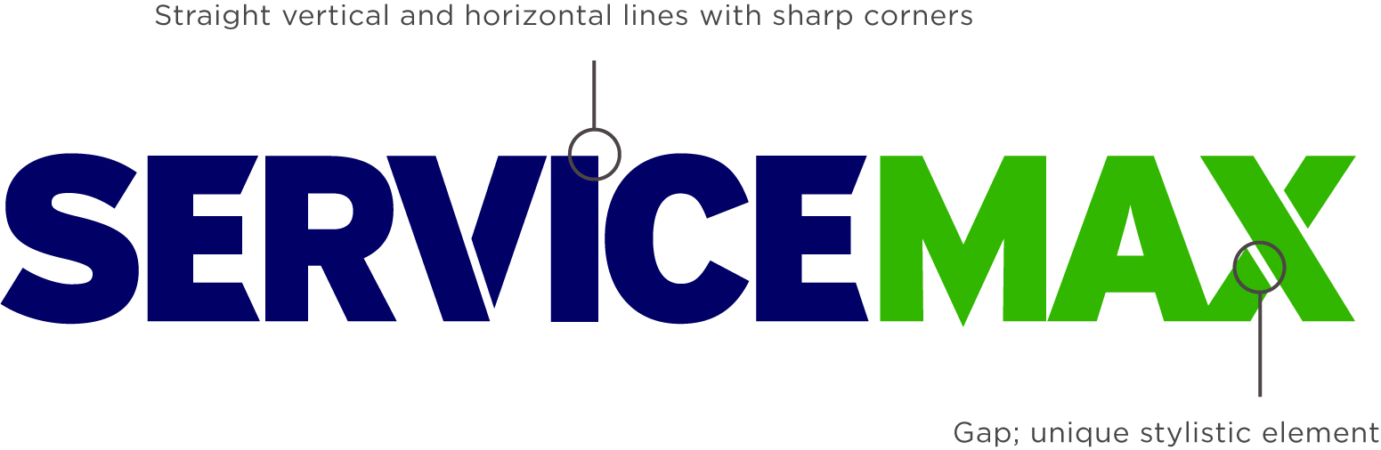
ServiceMax Product Iconography
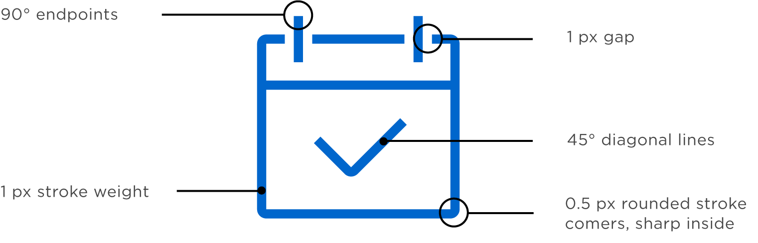
To make the icons look like a single visual family, they share the same unique elements from the ServiceMax logo.
Designing icons is essential to think about what the shape they should convey, so for our set we looked for some that are easily recognizable and instantly recognizable by everyone.
Another important consideration was to keep the icons legible at the smallest possible size (for example, as a menu item on a smartphone). This meant that we had to subtract and delete all unnecessary elements to do this.
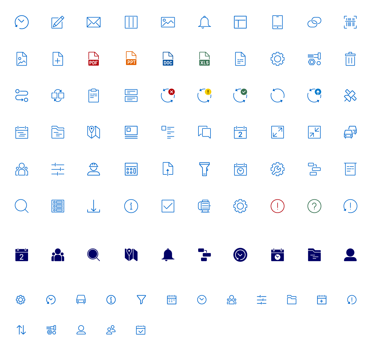
There may be more icons; therefore, it should be possible to easily create additional icons and keep them in the same style.
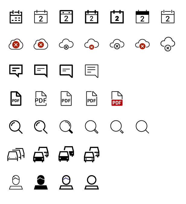
All final icons have the same stylistic elements. Here one of the icons sparked controversy; should the cloud sync icon be an industry standard and display the cloud, which represents syncing data with cloud servers? Or is it enough to visualize the a data exchange with spinning arrows metaphore?
Scheduling app UI
The target audience of the app are dispatchers, and the key objective of the product is set as optimization of a massive amount of data which dispatchers deal regularly. Every single piece of information about every task is vital for making the right decision, so creating the interface was essential to make it organized, clear, and easy-to-use. Intuitive navigation was set as the biggest priority to make the app applicable even for people with a low or medium level of tech literacy.
The app provides dispatchers with the functionality of saving and organizing data about technicians with the ability to find it quickly in a database when its needs.
The application needed a visual update as part of update to new visual identity of the company. Users requested to see more data on screen they can operate. Data structure needed cleaner hierarchy and visual simplification. Most of these issues can be solved by simplifying the UI and improving navigation.
After gaining some inspiration and analyzing current solutions, we had a basic understanding of what we wanted to explore and which ideas to push forward. Wirewraming out ideas helped us visualize and discuss the general direction and specific use cases.
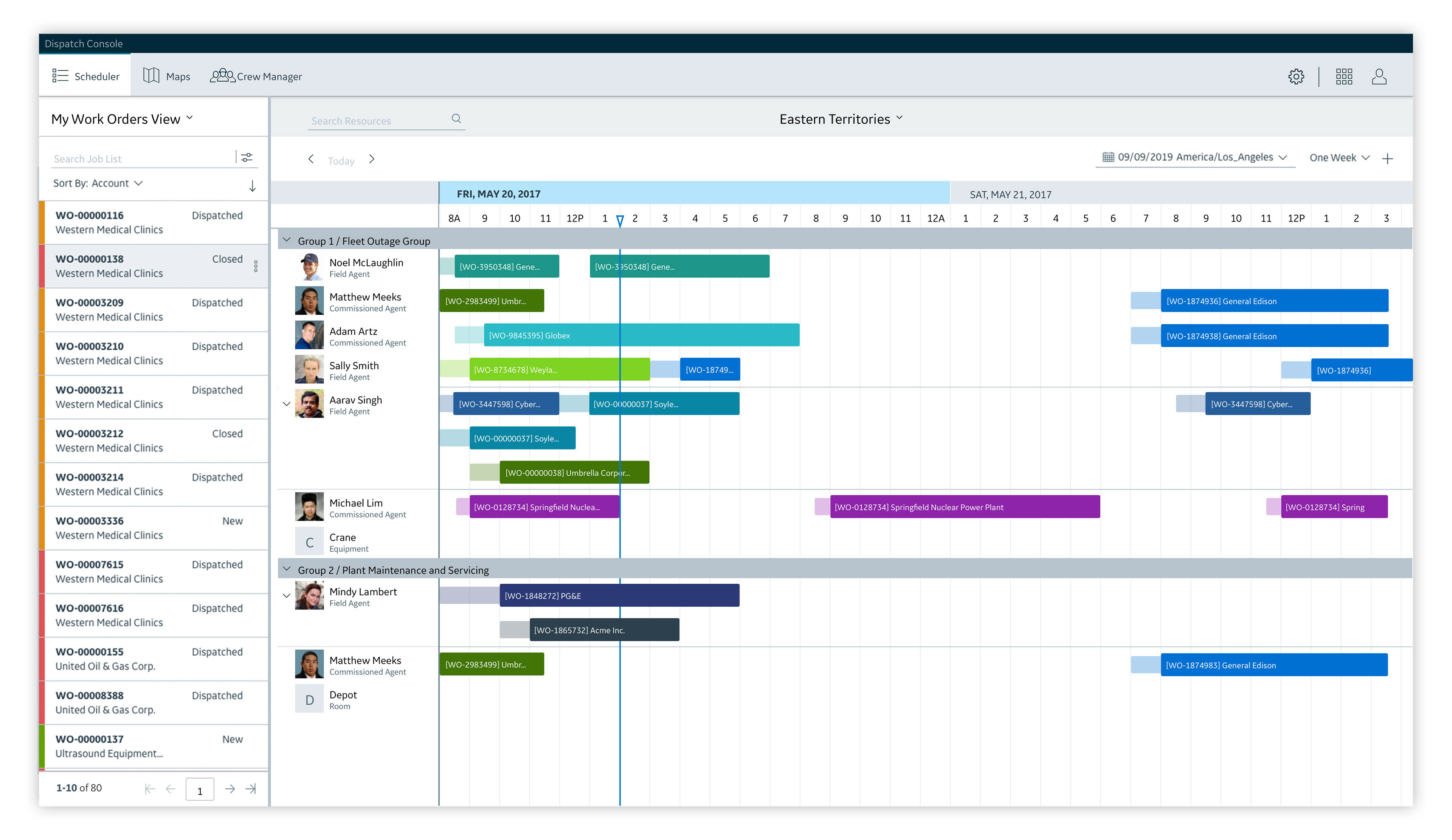
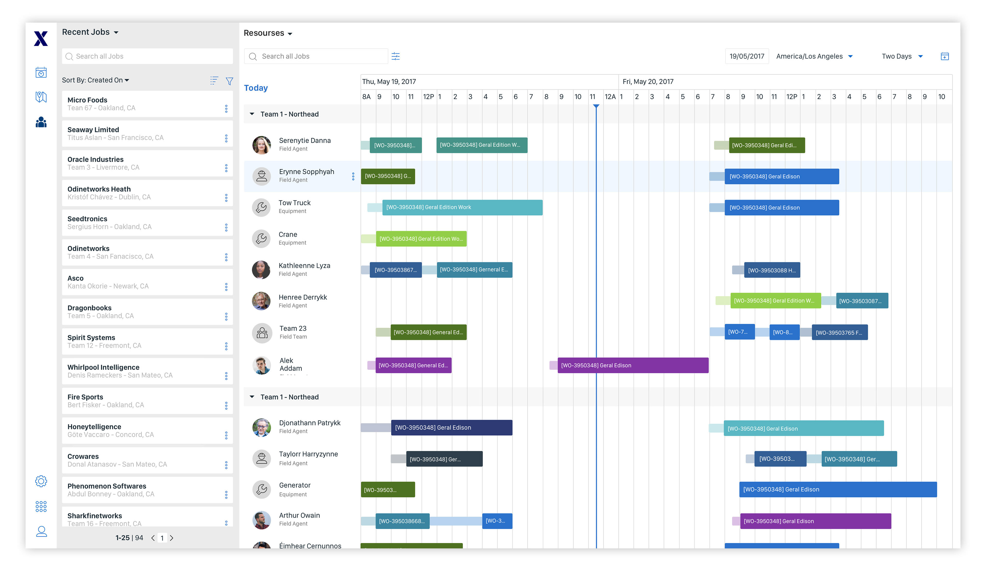
Scheduler screen
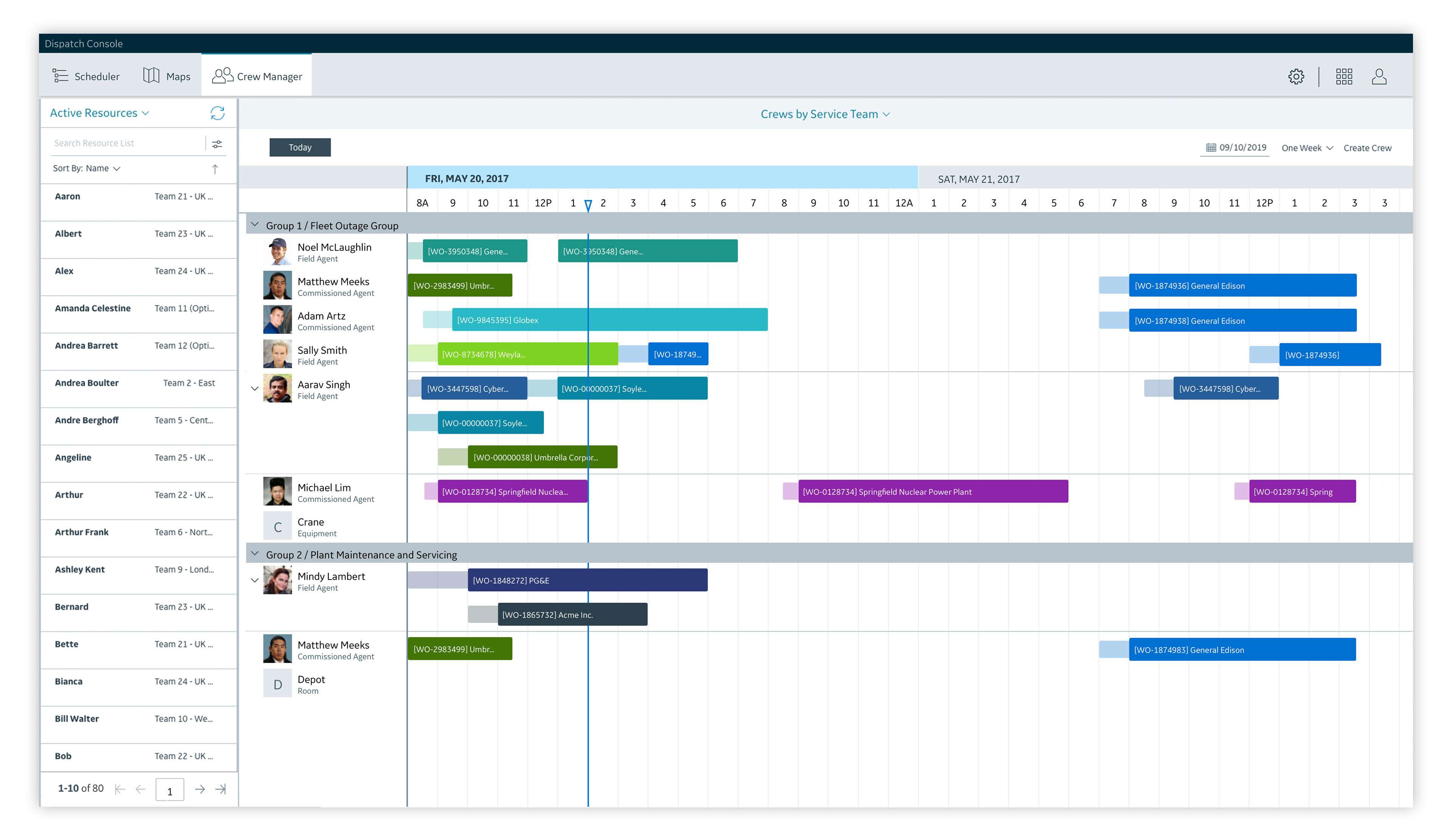
The app features the sidebar with three tabs located on the top left side of the screen represents Scheduler, Maps, and Crew Manager. On another side of the bar located Setting, Complementary Apps, and User Settings. In the future, we planned to add additional tabs, so vertical Nav Bar was a reasonable decision. The top-level menu looks visually cleaner and helps faster to interact with the Job List area.
Next to the Nav Bar located Jobs List. The Job List has two main types of interaction. Parts of data expands to show detailed information, and also it is draggable to attach as a project to a technician on another section of the screen. To prove that the cards are draggable on this screen, they have the shape of actual cards that set the association to the traditional physical objects.
The main field of the Calendar screen organizes data about all the appointments in three modes along the time — month, a week and two days, switched via the top menu. This part also gives particular dates shown on the screen. All calendar settings united to one drop-down menu.
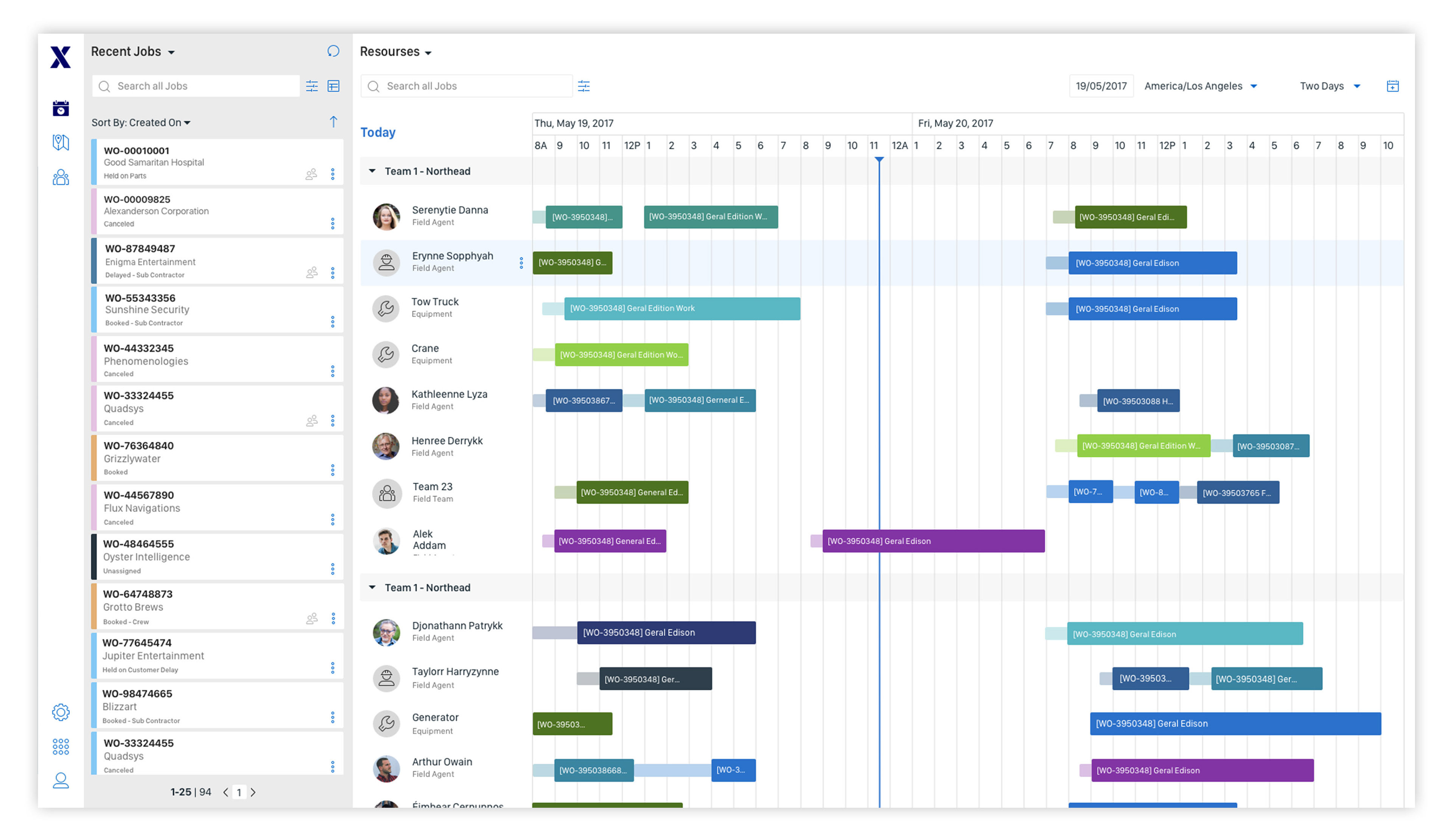
Before and after
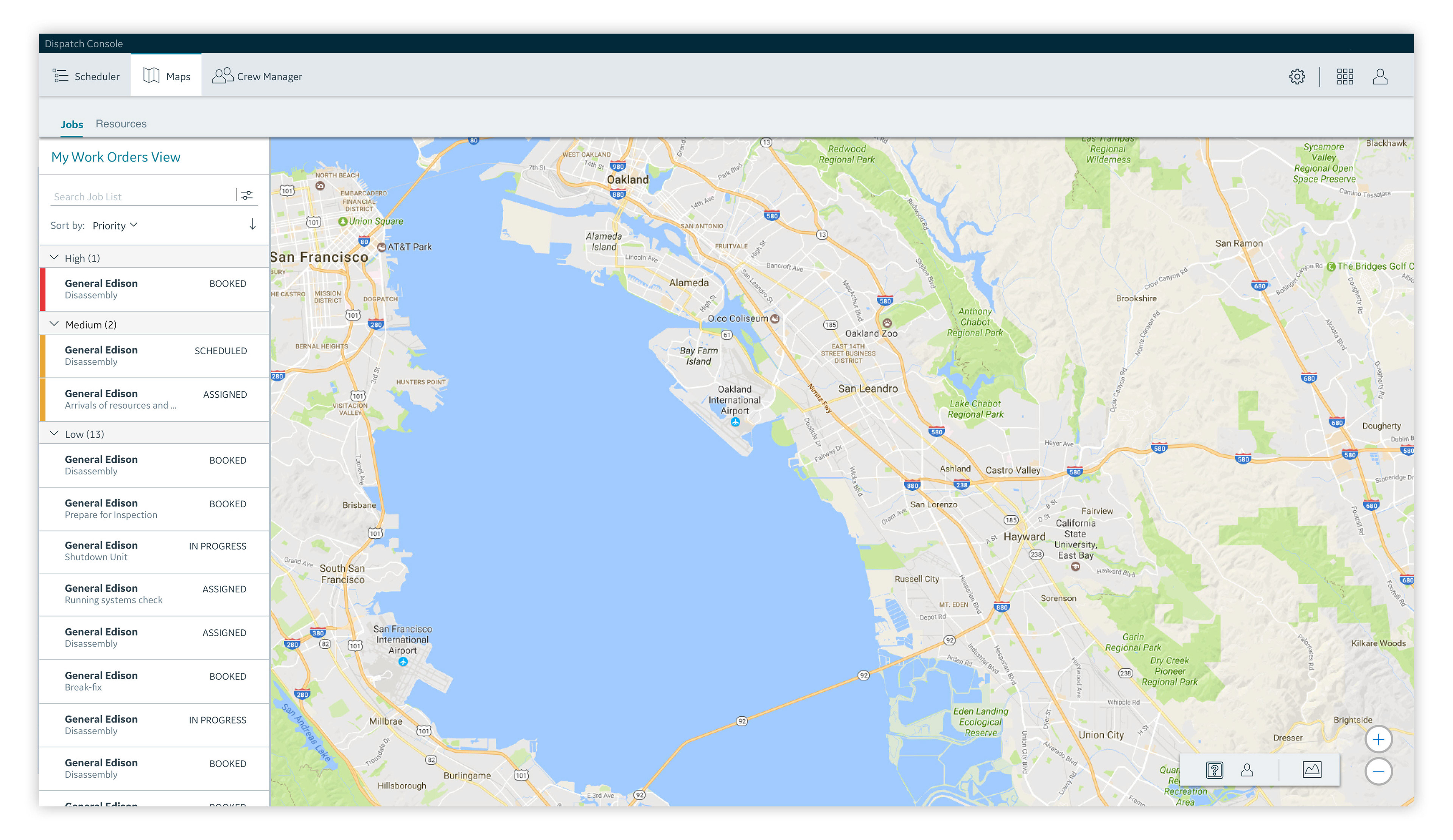
Maps Screen
The maps screen less UI adjustments, the job mostly was focused on the screen consistent visual representation.
Jobs List on Maps looks like a regular list because elements are not draggable, information divided by thin lines only. Another improvement is the map navigation look with new iconography. The navigation has a consistent look of the elements.
Before and after
Crew Manager screen
Crew Manager screen generally has a very similar user interface update, the difference is that instead Jobs, Resources has the same look (technicians and teams of technicians).
Before and after