Audit
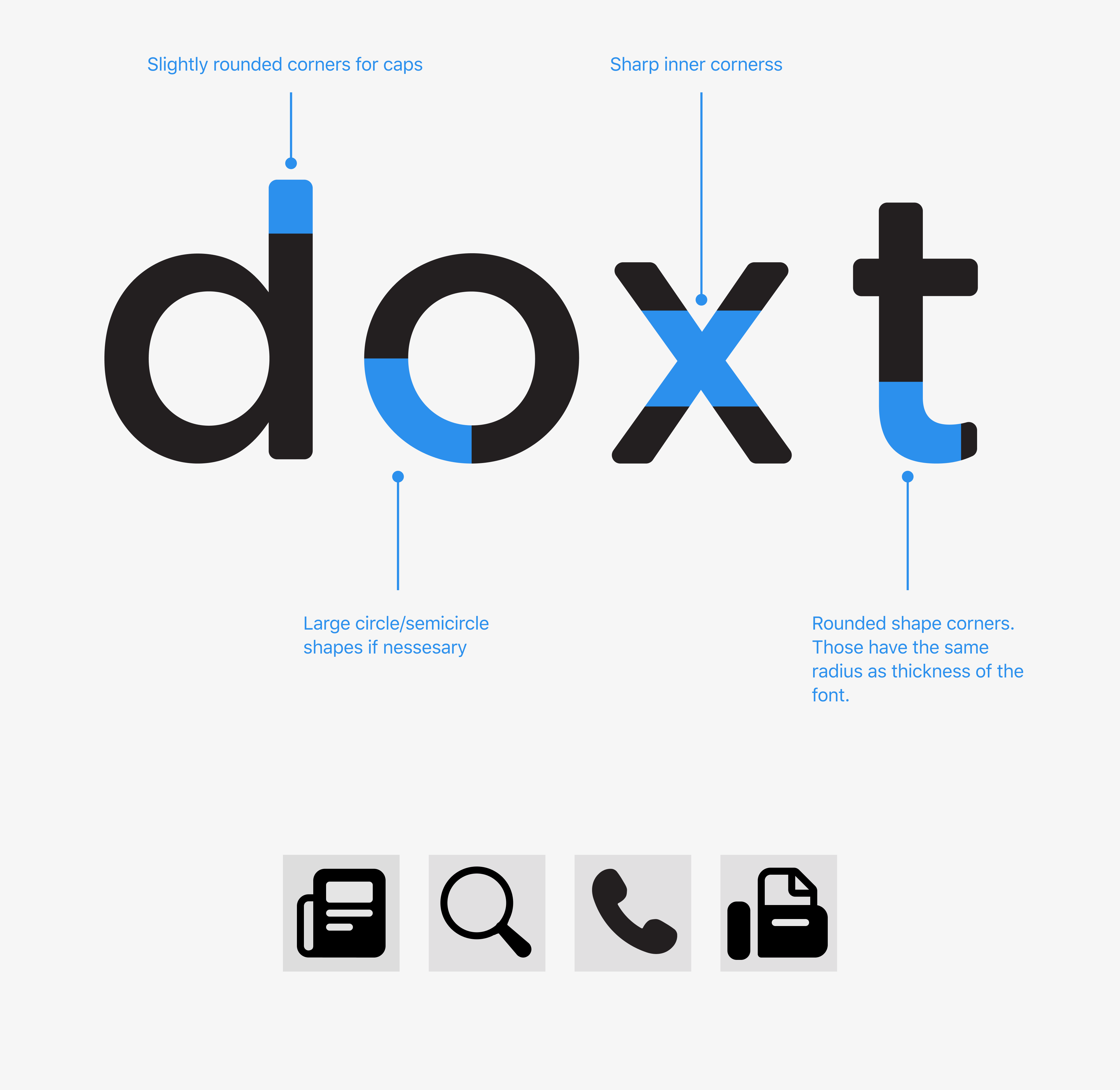
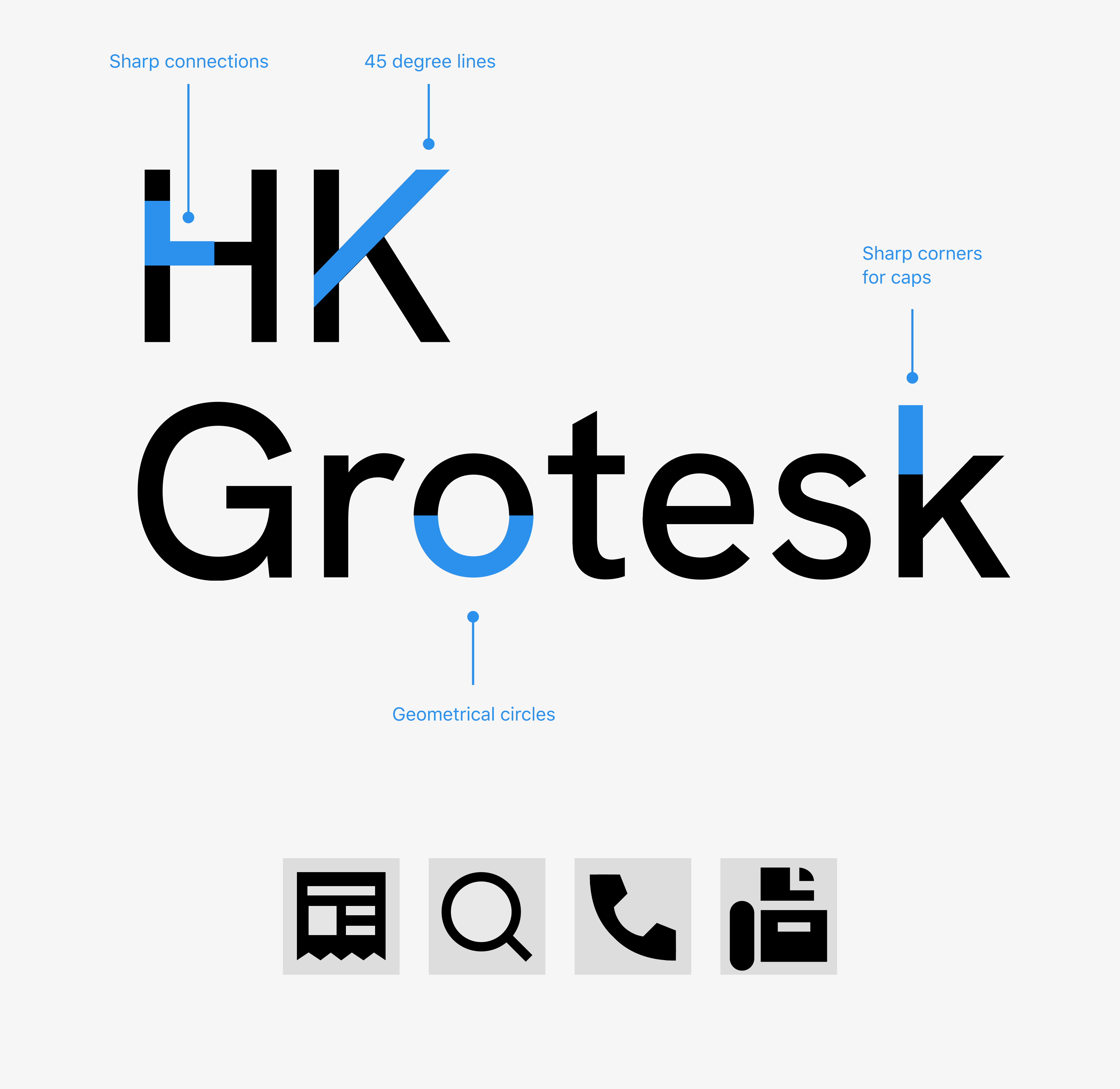
Illustration and icons have extra anchors that can cause of time of parse those. Inconsistent corner radius and stroke line thickness; found 4, 5, 6 px. Icons doesn’t have a key lines (with the key lines is easier way to control visual balance and keep constant icons). Various padding sizes; 14px, 18px, 24px, 25px, 26px, 28px, 30px, 36px. A number of icons have extra details. A high level of detalization can be cause of poor readability in small size.
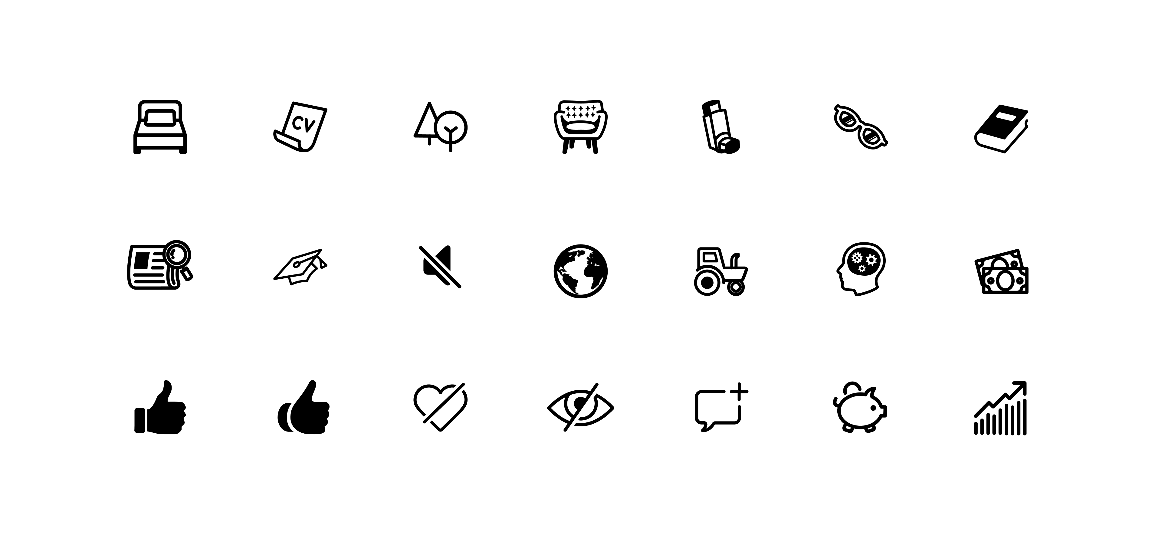
The icon set before update.
Based on feedback and careful consideration, the decision was made to proceed with the option based on the logo. This choice was driven by the belief that it would create a friendlier experience for our users and establish a stronger connection with the brand.
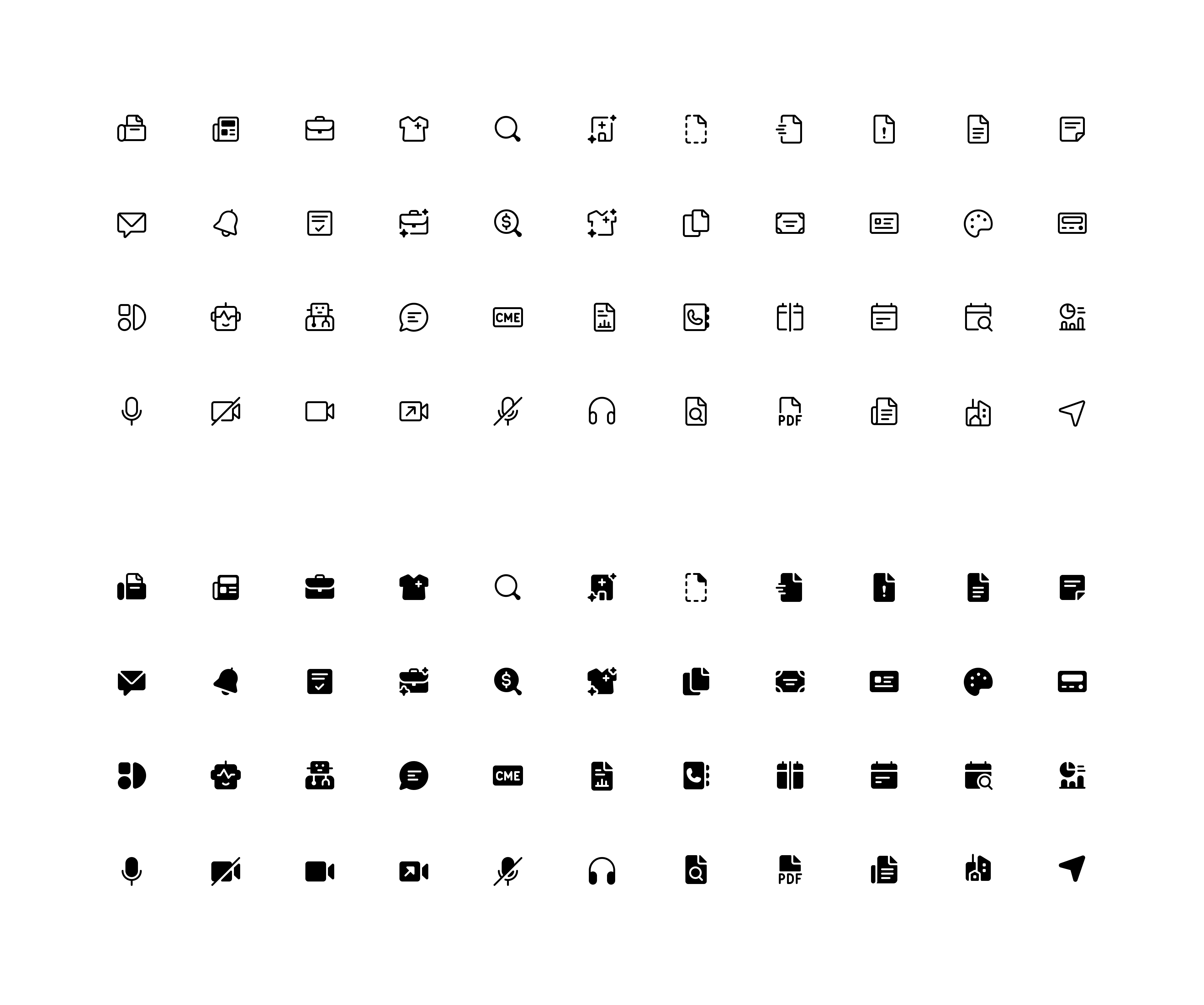
Additionally, two styles of illustrative iconography were created to enhance marketing materials and provide visual explanations of the product's functionality and various actions. These icons serve as valuable assets in effectively communicating complex concepts and features to users, enabling them to better understand and engage with the product. The first style embodies simplicity and minimalism, allowing for clear and straightforward representation. The second style embraces a more playful and expressive approach, adding a touch of creativity and enhancing the overall visual appeal. These diverse icon styles further contribute to a comprehensive and engaging brand experience.