Case Study: Emotional Health Icon
Project
This icon request came as an initiative to create a hub with all helpful information to help people get resources to take care of emotional health, or find help for a friend. Meta has partnered with experts to make it easier to find information on Facebook.
Design Process
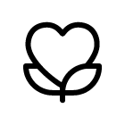
At that time a requestor had ready all visuals including flow screens and color illustrations. The illustrations contained flowers as a symbol of love and balance. Aiming at providing a fresh perspective, I started from exploration and search of new ideas and ways to shape them. The biggest challenge was to give a face to metaphor of emotion + health, one of the option was to use the heart symbol, often known as a symbol of human emotions and empathy;
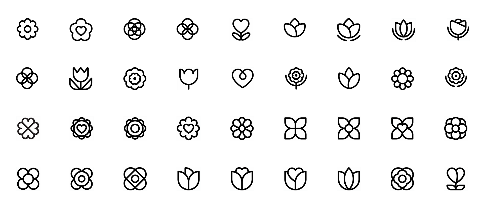
After the first review, we selected a few options that had a potential, and through discussion and feedback we came up with some additional icon ideas.
The standard set of icon features includes outline, filled and color icon options, the next step was to work on shape refining and visual and color variations of the selected icons. To pick which color we should use was a fairly simple decision; blue and yellow colors were used extensively in all illustrations, so we decided to use the same ones, to manta an obvious connection between the icons and the illustrations;
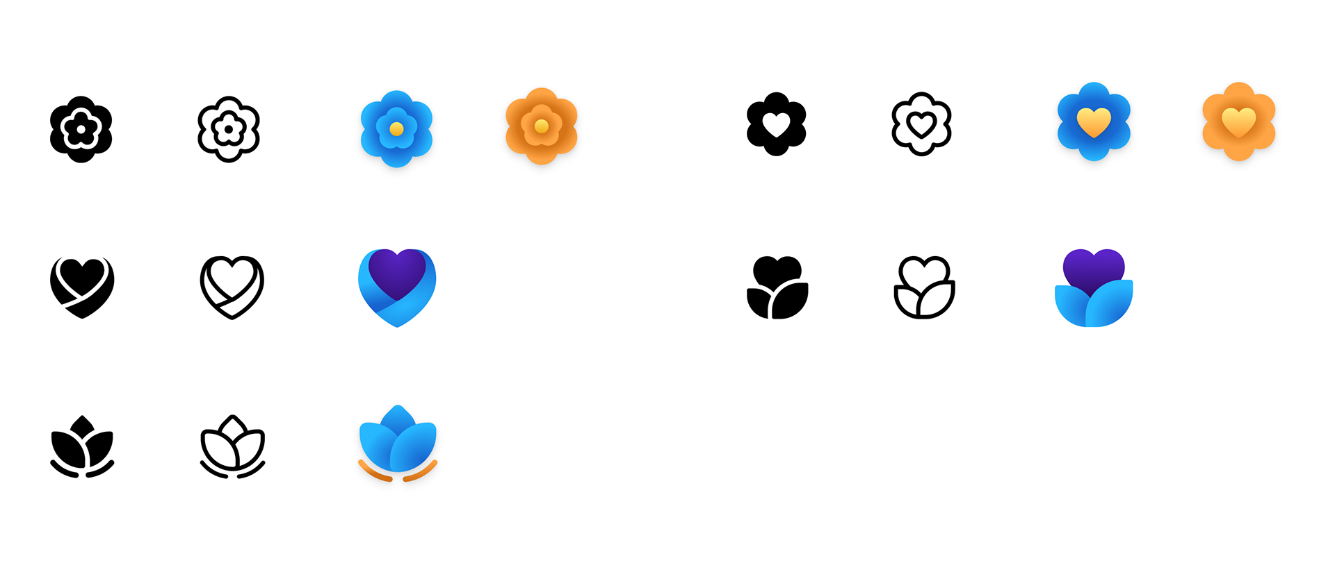
For final review, all color variations were tested for contrast ratio. The biggest challenge was to provide good contrast for the yellow gradient color so that it looks equally good on white and dark backgrounds and remains visible.
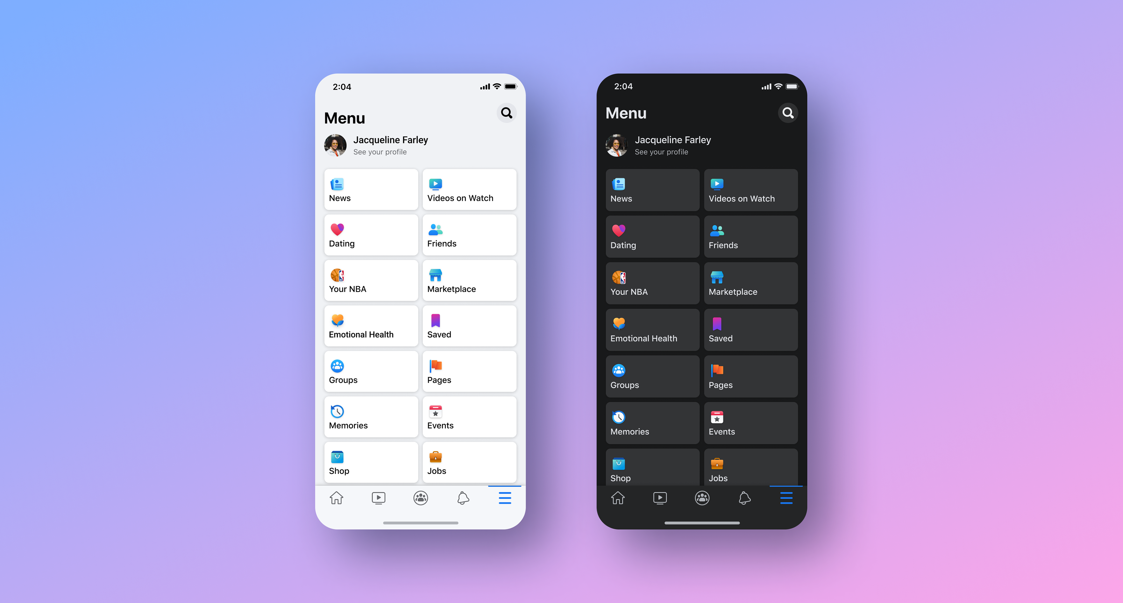
Because we wanted to talk about hope, empathy, and caring, end the product already used a lot of flowers, human support and hearts we thought the growing heart option is the right choice. Currently, you can find the icon on the bookmark menu screen and other places related to emotional support.
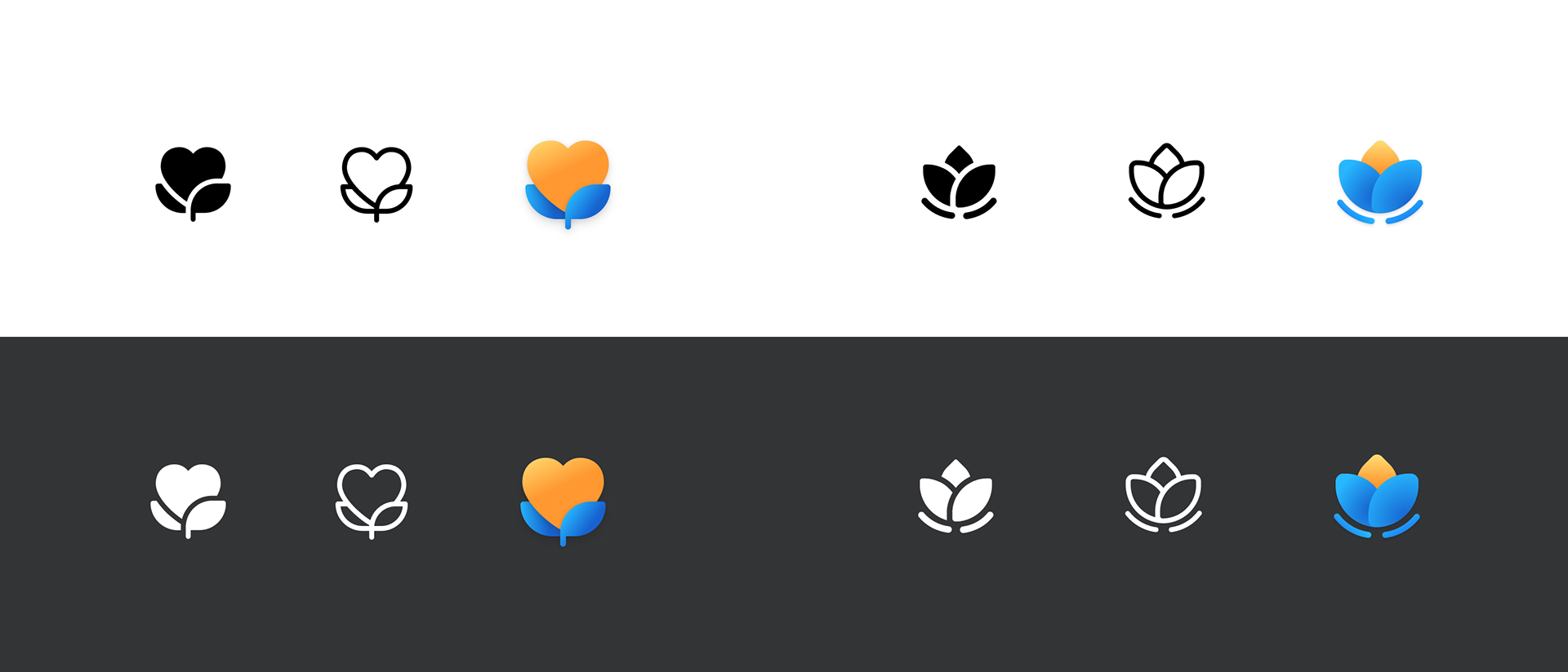
Also an important step is to compare and check the icon if it looks organic with the other colored icons from the set and check if it looks good enough in place to make sure it is clearly visible and not missing any parts in such a small size.
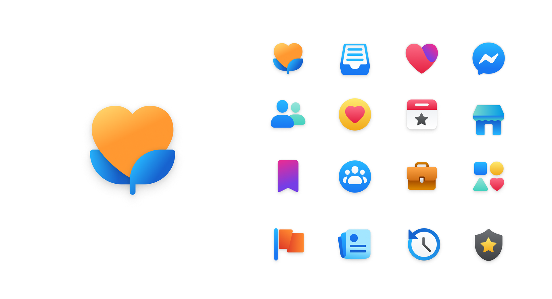
Iconography
Default outline style state.


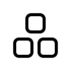
Filled icons used for a clear selection state.


Multi-color icons which are generally used for brand, sub-brands, features and functionality that requires utmost visual hierarchy.