My role in the company was to create a visual style for all printed materials intended for patients. When I joined the company, some of the assets had already been created; new logo, color palette, fonts and and a Vitality Graphic Device; three components that have their origin in the logo symbol and are flexible in composition, which allows to create endless arrangements. of the company;
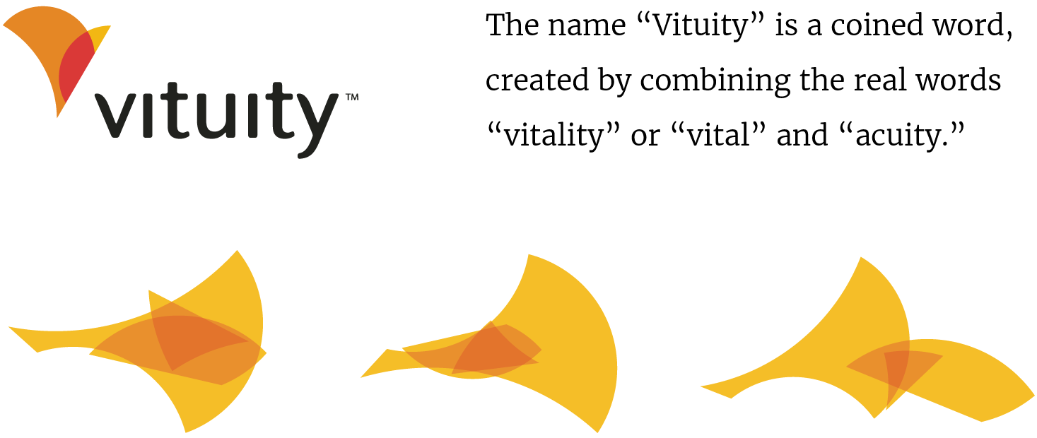
The logo, font and "Vitality Graphic Devices"
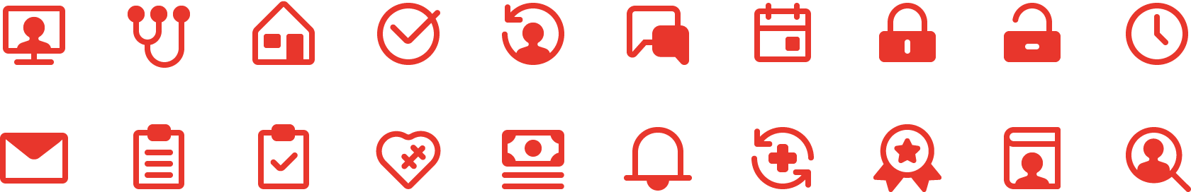
Vituity iconography
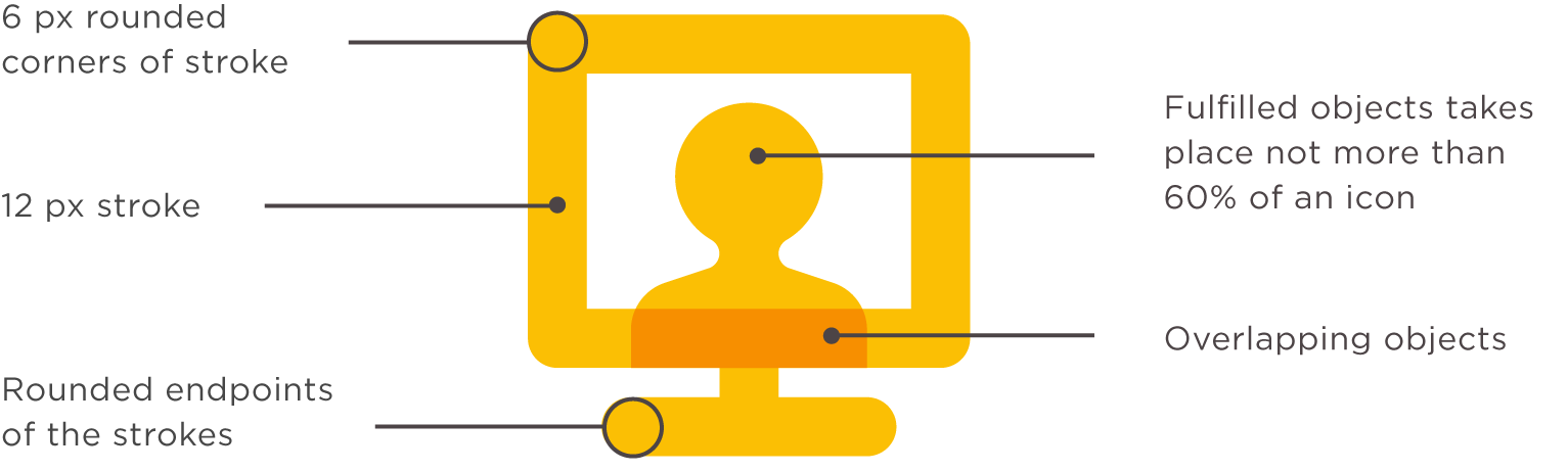
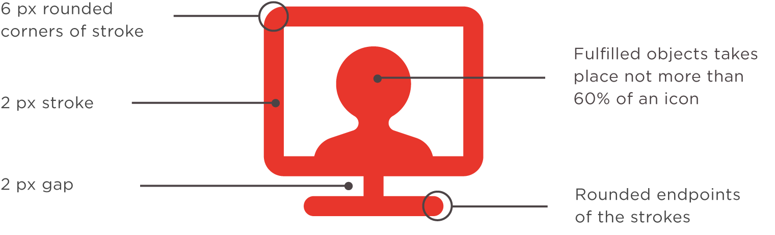
As part of the project was to create ownable iconography and illustrations, whose unique style was inspired by the logomark and the Vitality Graphic Devices. In the study of the iconography style I explored with implementation of three elements that contain a certain effect of overlapping with 3 layers of the orange, but after some iterations I quickly find out that not all icons contain three elements, and if they have, overlapping can be visually not satisfying what harms the consistency of the set, so because of this was decided to use only 2 elements.
To create a connection with the logo and visual components, the icons were designed to be a certain thickness so that their overlay is visible. The icons have certain rules, including the use of sharp corners and rounding, which is important for maintaining consistency and harmony with other elements.
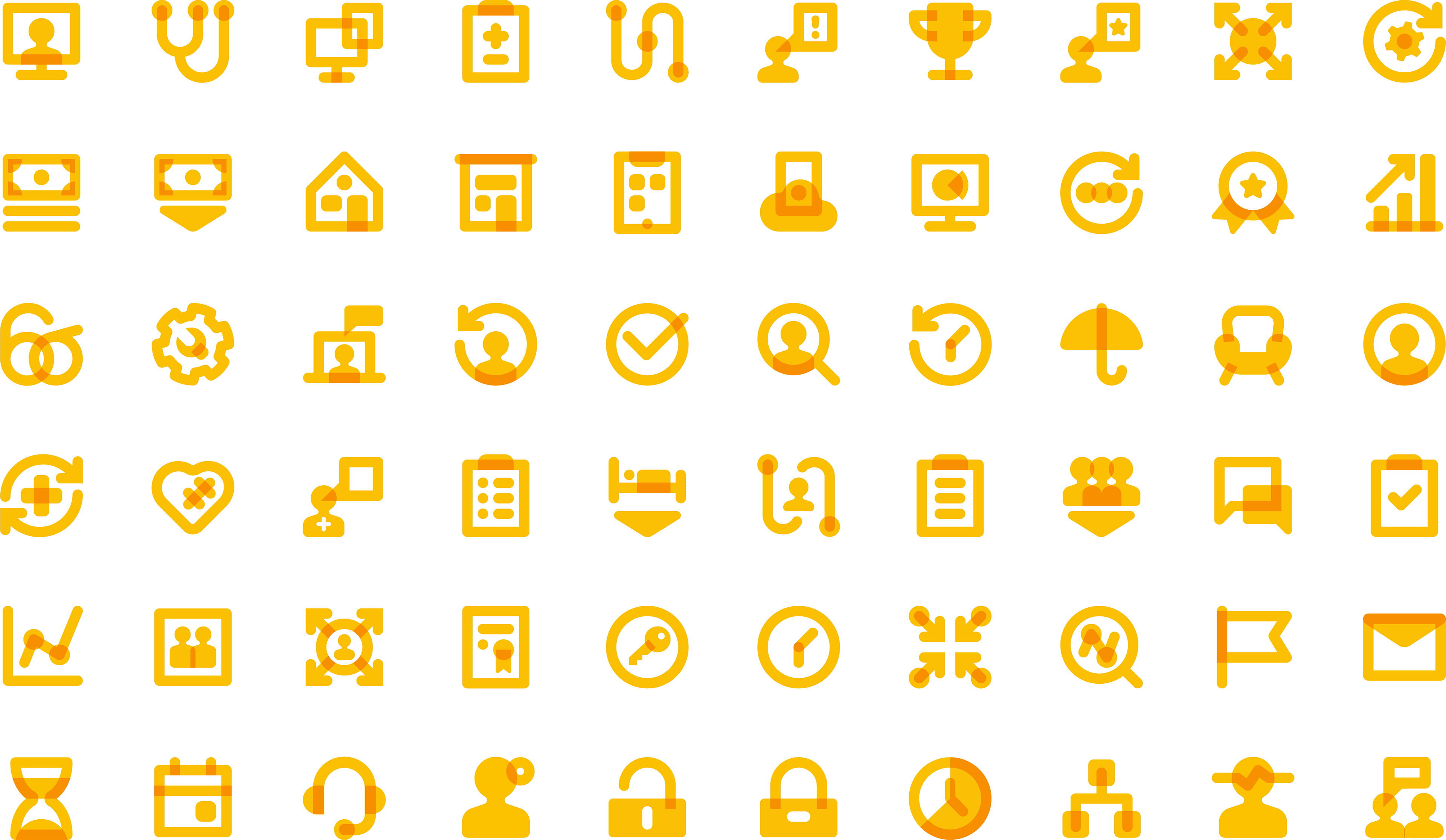
Additionally was created less detailed icons set for app; in this set we wanted to make sure that the icons follow the accessibility and have a good contrast ratio. With some exceptions the both sets share the same rules that help maintain consistency across all assets.
Illustrations
Individuals depict the goal of figures in environments that tell a story and set the context. For this purpose created several sets of simple characters and equipment that easily assemble in scenes. The illustration uses simple, friendly shapes and balanced color ratios to ensure that the scene never feels too chaotic.
Was tested various appearances of human illustrations within the brand colors.
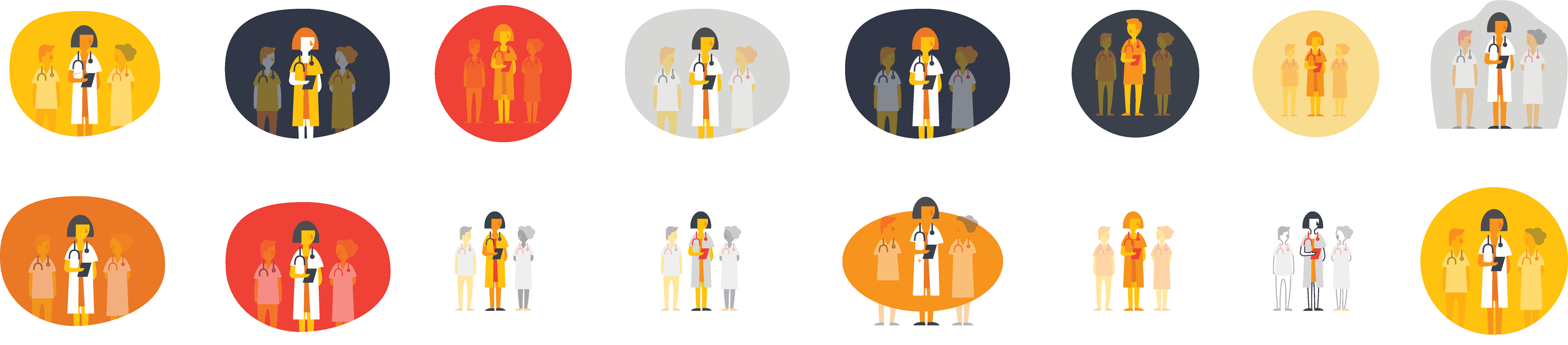
One of the main requirements was to preserve the visibility of the illustrations on the screen using a video projector.
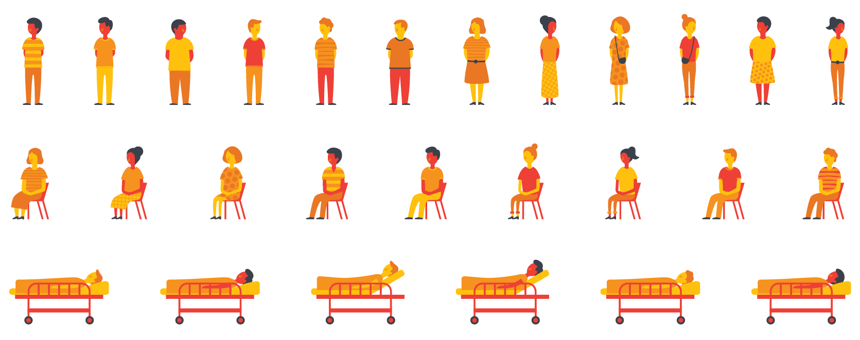
Patients Character Variations
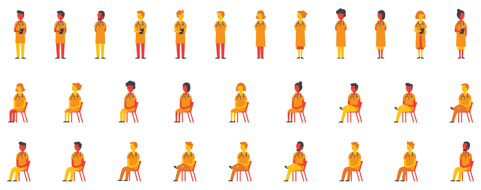
Patients Character Variations
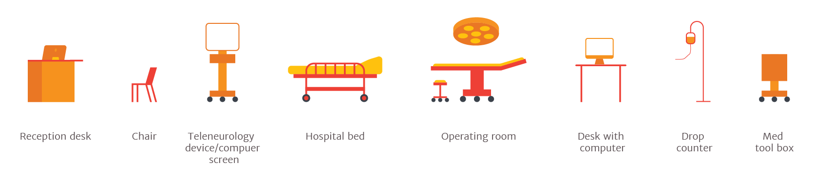
Hospital Equipment Variations


Example how an Illustrations may look assembled
Print Visual Asses
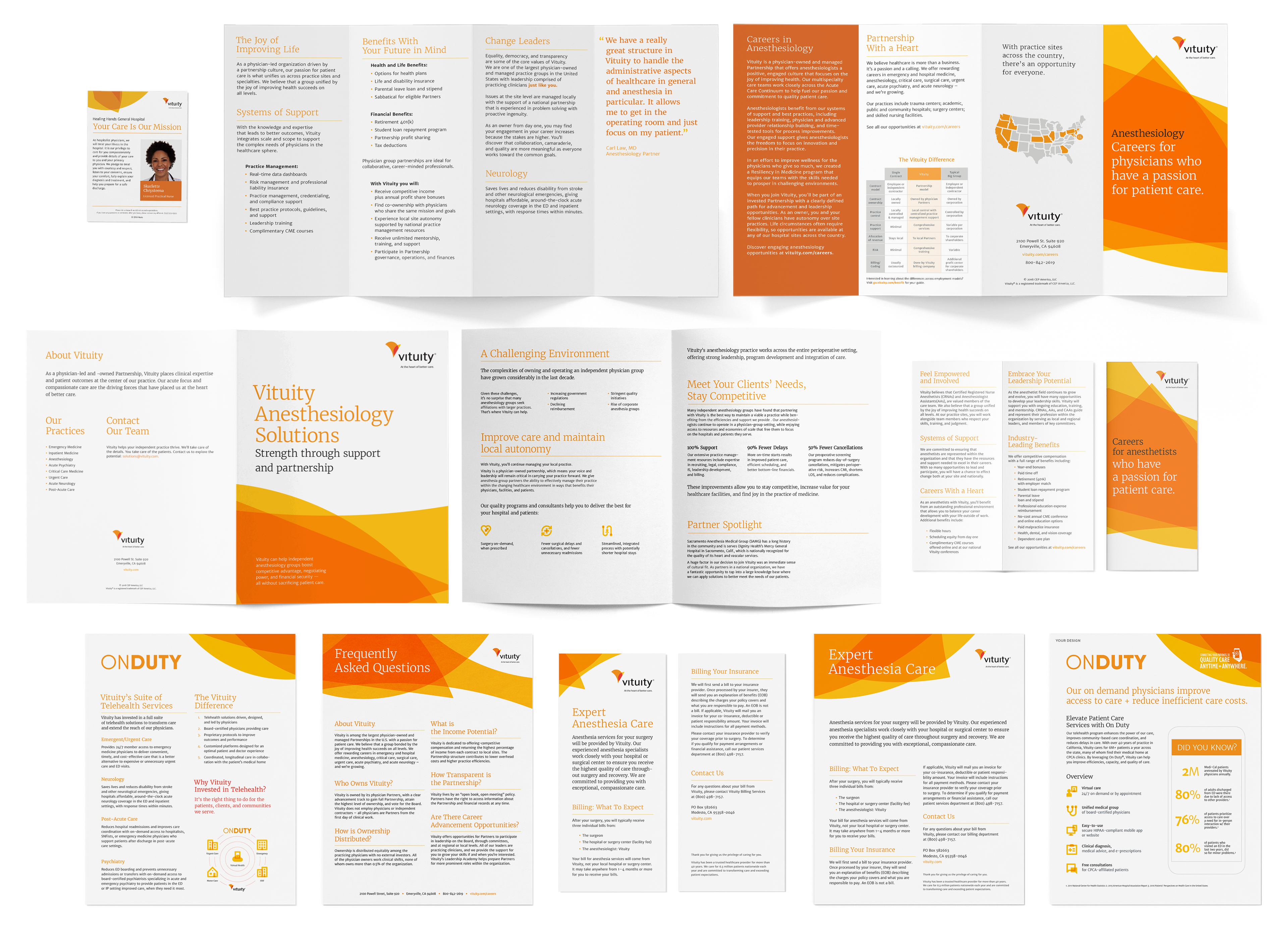
As part of the transition from old companies' visual style to the new one, I developed print assets, including brochures, flyers, contact cards, etc.